Wednesday, 17 December 2014

My first Mini Album

I am an avid browser of Youtube craft videos, and I see so many talented people out there, making so many amazing things, pushing the boundaries much further than my card making ever hasHaving watched so many videos, I finally decided it was time to step outside my comfort zone and try something new - no mean feat with 3 small children and no time.  This little project has taken me several months, but I have to say, I am so happy with the result, that it was totally worth it.  There are certainly elements of the mini album that I don't think worked for me, but on the whole, I just love it, and I can't wait to crack on with my next one (although before I do, I have been totally inspired to try a few other things too :-)

So - here goes!!!


The cover of the album is one of the things I love most about it!  The paper I chose is just gorgeous by itself - which is one of the reasons I chose to leave the back of the album completely plain apart from the trim, because that paper just doesn't need any embellishing!

I decorated the front of the album using paper flowers from Wild Orchid Crafts, who do the prettiest range I've ever seen, and for a really good price too.  The yellow forsythia flowers I cut with my Sizzix using the Susan Tierney-Cockburn die, with a string wrapped wire stem, and some Stickles for the centres of each flower.  The angel and the frame are Prima resin embellishments which I think are just so cute!  The frame is fastened on 3 sides, but the top is open to slide in an image, or a title, I've not quite decided yet.  I used a Tim Holtz Sizzix honeycomb die as a background for the flowers and embellishments, and I used chocolate pleated ribbon, taupe ribbon, and pearl drop trim all around the bottom.

The rings binding the album are wrapped with vintage seam binding in co ordinating colours, and I made the charm chain with 3 cute charms. 


The inside cover is just the reverse side of the paper I used for the outer.


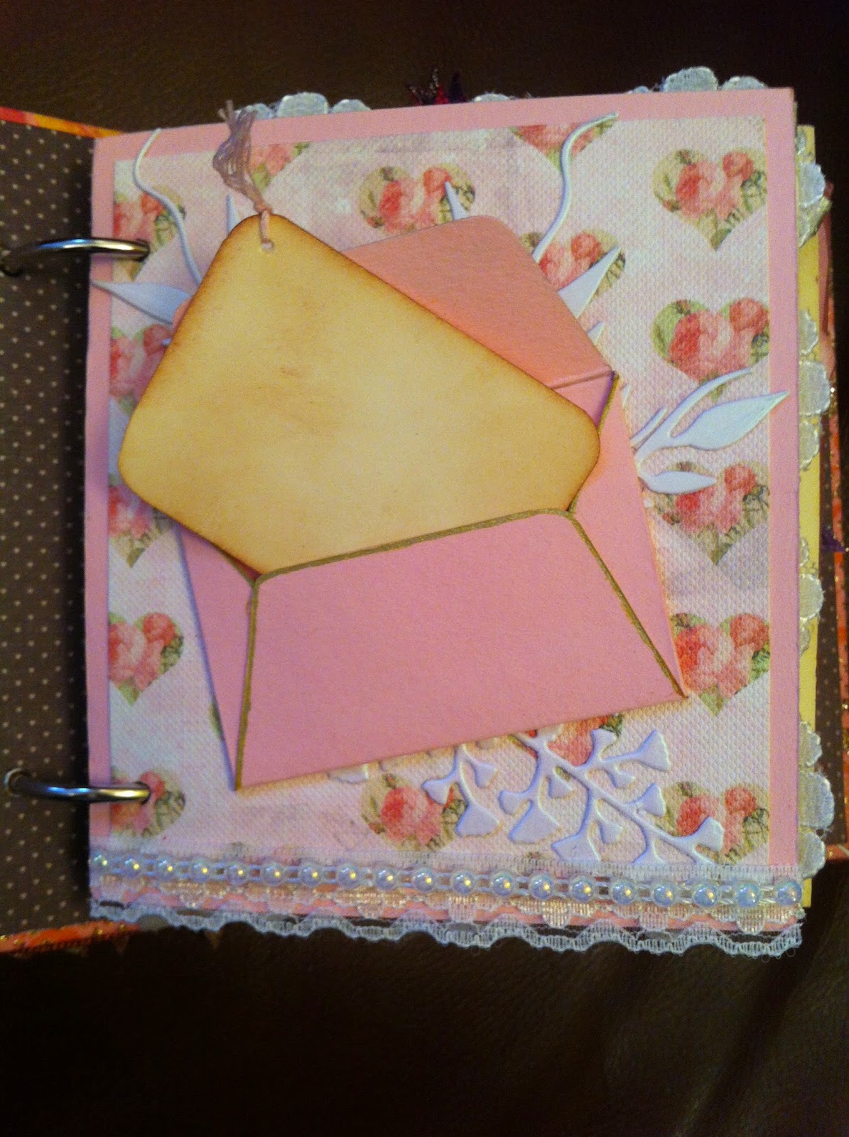
The first page above is an envelope with a tag inside.  The tag is just plain and inked.  I'll probably use the tag as an 'contents page' for the album.  I used die cuts and beaded trim to finish the page.


The reverse of the first page is a flap page.  I used lace to surround it, and will either use the page as a photo mat, or possibly put a quote on there.  The reverse of the flap has a pocket with a tag, and a die cut flower collection, which is adhered only in the corner, so another tag sits tucked underneath it.


The next page, I just used two die cut embellishments which are adhered around the outer edges only, so it will be perfect to tuck a photo in there.


This next page is actually one of my favourites.  I used the tree stamp from the gorgeous Gina K stamp set, The Giving Tree - but I made mine into a blessing tree!  I printed the letters onto tiny circles I cut out just using a normal hole punch, then I punched out tiny leaves from the same paper I used for the cover and adhered them to a length of bakers twine, which I then fastened top and bottom with brads.  I might tuck a small photo behind the string, but I won't be able to bear covering up too much of that gorgeous tree!


The next page is quite simple, I just used some bling and a tiny butterfly I made.  Every page in this album is a pocket - some I've left without anything in, so I can tuck photos or perhaps make tags at a later date - but many I've already created tags for - and this is the first.


This next page (above) is one of my less favourites.  I do really like the central tag pocket, and I like the bobble trim and the die cut feathers - I think perhaps the background of the page doesn't work for me, it's too dark, or just the wrong shade, or something!!!  Can't wait to use those little mats in the fold out tag pocket to put some little pictures and quotes on though!


I think this next page (above) is so pretty!  I love the flowers and the little heart in the corner.  The purple die cut along the bottom is adhered just at the edges and bottom, so it forms a little pocket to put photos/tags in.


Loving this next page too - the pull tag waterfall is cute and will look lovely with some little photos on.


Another page that worked well for me - a box card page


My movies (above) and wine (below) pages!  Above, the film strip is secured along the bottom and down each side, the tops are open to fit small photos.  The 'viewfinder' pulls out, as does the bottom tag, and each could be used to journal or as a photo mat.

Below, the wine charms (Taylored Expressions dies) are attached to some bakers twine - I was going to try and leave it loose so things could be tucked behind, but the charms are a little fragile, so I used foam sticky pads to secure them down.  The page is also a side pocket for a tag, with a little ric rac to pull it out.


The reverse of the wine page is my gears page - below.


The gears are all die cut, and strengthened with Glossy Accents.  The tag sits behind the side gear panel and can be pulled out and used as a photo mat.  It's kind of different to my other pages, but I really liked how it looked.

Finally, below, I've included some pictures of some of the tags which sit in various pockets.


For the most part, I like the tags, but the pocket structure that they sit in is one of my misses, I think.  Elements work, but others don't....but that's how it goes!

Monday, 1 December 2014

My 7 year old sons birthday card!

I had to think hard what to do for my son this year.  I wanted to do something a bit different, but keep with the theme of the board cards I like to do for my children's birthdays.  Sooo, I went with the board base, and a modified box card design on it.  My boys both like Superheroes and comics, so I decided to create a little comic book to go inside the box card, using family in jokes which I won't explain here!

The board and box card are relatively simple, but I think it worked well - and the comic inside certainly went down a treat!


2 super quick emergency birthday cards.

Well, yet again, my dear OH managed to forget his two grandmothers birthdays (which coincidentally fall on the same day!).  I know I should take over running his calendar, but then he'd never have to use his brain at all, and goodness knows what might happen!  Anyway, amidst birthday party planning and card making for my eldest son, I had to whip up the quickest birthday cards ever.  


Die cut flowers from the same glittered paper as the band across the card, Liquid Pearls as the flower centres, and a stamped greeting.  10 minutes, and voila!!

Wednesday, 12 November 2014

Christmas card set

I recently bought some of the new Taylored Expression winter/Xmas stamps (and one matching die), and decided I wanted to make a set of cards using the stamps & die, but keep them relatively quick and simple.

The die and one of the stamps is the Snow Globe set, which I thought was really lovely and quite versatile in terms of what you can use it to frame.  The stamp sets were the Ready Set Snow and Deck the Halls sets.  I used the Snow Globe set on every card, then chose images from the Ready Set Snow and Deck the Halls sets to go inside.  I coloured them all with Promarkers, then put all the cards together using papers from the Dovecraft Contemporary Christmas pack.  I kept embellishments to a minimum - I used a little ribbon on a few, and some Stickles, but other than that, nice clean, simple and quick cards.  I'm pretty happy with how most of them turned out - some I like far better than others, but isn't that always the way!

 There were 7 in the finished set.


 My favourites include the two at the back, and the card front and centre.


And I love the card on the right.  That fox is so cute!


I'm now looking forward to playing with the Snow Globe set in other ways - it would be perfect for shaker cards, princess cards....gonna have some fun!!

Tuesday, 11 November 2014

Baby cards

Here I've uploaded some cards I've made for babies. 


 This one goes back a bit.  I made this for my sisters first baby.  The teddy is made from Fimo.


 This one was made for the third child of a good friend of mine. I used wooden circles for the buggy wheels.


 I liked the effect sufficiently that I duplicated it recently for a relatives second child.  This time instead of using the wooden circles, I used a cog die, which I cut the teeth away from, then heat embossed the remaining circle with silver embossing powder.


 This card was for my second son's first birthday.  Again, I used Fimo to make the embellishments.  This was my first attempt at a board card (I'd seen one somewhere on the internet - I'm sorry, I don't remember by whom at this point), and I really love how the card looks.


 This final card is my second board card, which I made very recently for my daughters first birthday.  I really love how this turned out also, although I have to be honest and say that it wasn't nearly as much work as the first board card (three children, no time...).  The background paper is from DCWV's gorgeous Once Upon a Time collection, and was so pretty it took care of a lot of the card for me.  The fairy die is called Fairy Ariana - which I HAD to buy, merely because it's my daughters name, so I couldn't NOT use it on her birthday card!


Masked and inked cards - his and hers and........his?!

I inked these cards using a technique demonstrated by Theresa Momber.  The first couple were made in a deliberately masculine and feminine style, but the last could easily be either - I used it as a birthday card for a male relative, but could easily have altered it slightly for a female card, probably by using a little more purple & pink ink instead of the blue (forgive me for the stereotypes - I feel just as comfortable giving any card to any gender, but I tend to make cards directly for the audience intended, and for my family & friends, that tends to be relatively traditional!)


Apologies for the first image, the lighting is terrible!

Monday, 3 November 2014

A few more old cards


This one was done for my Mum, some years ago just after my eldest was bornIt's a little light on embellishments, and if I were to do it over, there would definitely be a little more going on to enhance (I'm thinking Stickles, a bit more done with the flower border punch, and definitely a little something to edge up the pink area), but I still kind of like it nonetheless.


This card was made for my OHs mother, the same year.


I don't include a lot of stitching on cards, mostly because I don't have a working sewing machine, and neat hand stitching can be somewhat time consuming.  But, when what you've got is quite simple, a little stitch work can do wonders to finish things off.


The focal image here was all small pieces, individually cut out with the Big Shot and arranged & glued down before adding the basket.